


Welcome back!
This is the continuation of the previous blog Lightning Web Components - Adding Styles and JavaScript.
In the last part, we made our component look a bit better and added some JavaScript too.
In this part, we'll tinker around with some more JavaScript by building another simple component. We'll build a Calculator, that takes in 2 inputs, and lets us perform some basic arithmetic operation and displays the result.
Let's get building
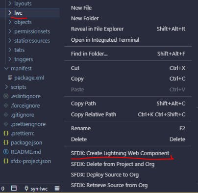
Fire up your VSCode. Call our best friend Command Palette and type in the command to create a new lwc.
Alternatively, you can right-click on 'lwc' folder in file explorer in VScode and select the Create Lightning Web Components command.
Let's name our component now and since I mentioned it's going to be a simple one, I'll name it simpleCalculator. I know, very Creative.

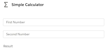
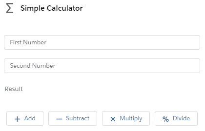
We will follow the same step as before. Let's add a card first as a container to hold our two input elements, we'll also add another element to display the output. Since we already know how to play around with the slds, we'll throw that into the mix as well.
<template>
    <lightning-card title="Simple Calculator" icon-name="utility:advanced_function" class="slds-text-align_center">
        <div class="slds-p-around_medium">
            <lightning-input type="number" name="firstNum" value={firstNumber} placeholder="First Number" onchange={handleFirstNum}></lightning-input>
            <lightning-input type="number" name="secondNum" value={secondNumber} placeholder="Second Number" onchange={handleSecondNum}></lightning-input>
            <lightning-input type="text" name="result" value={result} placeholder="Result" readonly></lightning-input>
        </div>
    </lightning-card>
</template>
After we save and deploy this to our org, we should be able to see something like this.
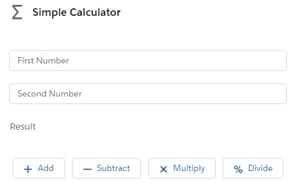
Now, let's add buttons to perform the math. We'll give the user the option to Add, Subtract, Multiply or Divide two numbers.
After ending the <div> tag previously, we'll add another one to hold our buttons.
        <div class="slds-grid slds-p-around_medium">
            <lightning-button label="Add" icon-name="utility:add" size="small" onclick={handleAdd} class="slds-col"></lightning-button>
            <lightning-button label="Subtract" icon-name="utility:dash" size="small" onclick={handleSub} class="slds-col"></lightning-button>
            <lightning-button label="Multiply" icon-name="utility:close" size="small" onclick={handleMul} class="slds-col"></lightning-button>
            <lightning-button label="Divide" icon-name="utility:percent" size="small" onclick={handleDiv} class="slds-col"></lightning-button>
        </div>
Also, did you notice we're using grid? You can read more about how we use grid in lwc here.
This should make our component look like this.
The UI looks good now, let's get down to JavaScript and make this thing work.
First, we need to declare our variables. Speaking of variables now is the time to talk about decorators.
The Lightning Web Components model has 3 decorators and these three decorators are unique to LWC.
- '@api' - Public properties are reactive. If the value of public property changes, the component re-renders. To expose a public property or a method, decorate it with @api.
- '@track' - Fields are reactive. If a field’s value changes and the field is used in a template or in a getter of a property that’s used in a template, the component rerenders and displays the new value.
- '@wire' - To read Salesforce data, Lightning web components use a reactive wire service. When the wire service provisions data, the component re-renders.
You can learn more about them here.
Let's get back to declaring variables. We'd usually declare with '@track' decorator but with the new version, we don't have to. Unless we specify a different decorator, any variable we declare will default to track decorator.
import { LightningElement } from 'lwc';

export default class SimpleCalculator extends LightningElement {
    firstNumber;
    secondNumber;
    result;

handleFirstNum(event) {
        this.firstNumber = event.target.value;
    }

    handleSecondNum(event) {
        this.secondNumber = event.target.value;
    }
We have declared variables and added two methods to handle two inputs.
Let's add a method to handle the addition operation.
handleAdd() {
        this.result = `The result of ${this.firstNumber} + ${this.secondNumber} is: ${parseFloat(this.firstNumber) + parseFloat(this.secondNumber)}`;
}
So this works. Phew. Let's do the same thing for the other three operations as well.
handleSub() {
        this.result = `The result of ${this.firstNumber} - ${this.secondNumber} is: ${parseFloat(this.firstNumber) - parseFloat(this.secondNumber)}`;
    }

    handleMul() {
        this.result = `The result of ${this.firstNumber} * ${this.secondNumber} is: ${parseFloat(this.firstNumber) * parseFloat(this.secondNumber)}`;
    }

    handleDiv() {
        if(this.secondNumber > 0) {
            this.result = `The result of ${this.firstNumber} / ${this.secondNumber} is: ${parseFloat(this.firstNumber) / parseFloat(this.secondNumber)}`;
        }
        else {
            this.result = "Invalid Input";
        }
    }
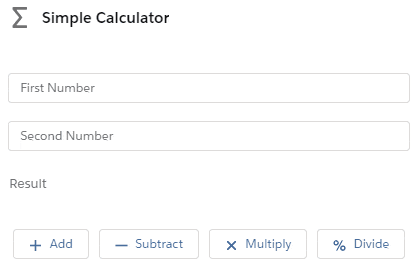
Let's see if this works.
And it does work.
Let's add one more functionality before we end this blog. We will build a Clear button that will, obviously, clear out all the values.
Let's start by adding one more button to our UI. I've also introduced a new attribute called variant to the button element and assigned the value of 'brand' to it. Let's see what difference that makes to the button.
<div class="slds-grid slds-p-around_medium">
   <lightning-button class="slds-col" variant="brand" label="Clear" onclick={handleclear} ></lightning-button>
</div>
Let's also add a method to handle the Clear button.
handleclear() {
        this.firstNumber = '';
        this.secondNumber = '';
        this.result = '';
    }
This will clear all the values when we press the Clear button. Or, will it? Let's deploy our new changes to the org and see the changes.
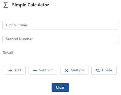
Noticed how the variant attribute changed the button? You can read more about it in the Components Library.
To sum up this part, we built a UI for our Simple Calculator component using a Card, a couple of input fields and buttons. Then we played around with JavaScript to make our component work as expected.
In the next part, we will learn how to conditionally render elements and a little bit about the arrays.
If you liked this, keep an eye on this series.
Thanks for stopping by. :D