Welcome back!
This is the continuation of the previous blog Lightning Web Components - Introduction.
Previously, we learnt how to prep our Org, set up our VSCode and finally we deployed our first component.
 Now we'll make it look better and add some JavaScript.
Let's build a better UI. Before we do that, bookmark the below links. It'll come in handy later, Trust me.
If you noticed in the previous screenshot, every other component apart from ours has a nice white background. Let's start with adding that.
<template>
    <lightning-card>
    <p>Hello. This is my first LWC.</p>
    </lightning-card>
</template>
This adds a lightning card element and our UI will look like this.

Now is the perfect time to talk about SLDS.
SLDS is Salesforce Lightning Design System. It is a CSS framework that gives you access to the icons, colour palettes, and fonts and helps you build applications with the look and feel of Lightning Experience without writing a single line of CSS.
You can read more about it here.
If you refer to the Component Library for the lightning card, you will also see that we can add title and icon to the card.
We can try this out. Modify the HTML as below to add a title and an icon to our card and some margin and padding to our text.
Also, notice the way we write slds styles. That's the syntax we should follow.
<template>
    <lightning-card title="First Component" icon-name="utility:fallback">
        <div class="slds-m-top_small slds-p-left_small">
            <p>Hello. This is my first LWC.</p>
        </div>
    </lightning-card>
</template>
Adding these changes and deploying the code will make our component look like this. A bit better now, isn't it?

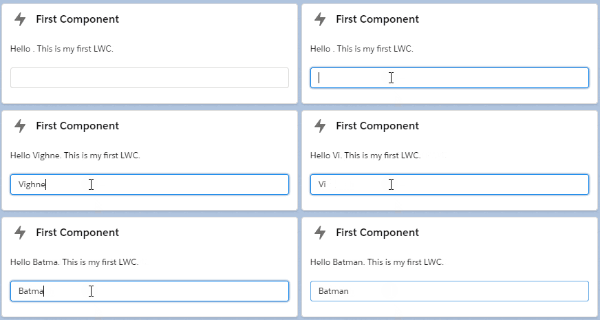
Let's go a step further. Instead of just saying 'Hello' there, we'll try to make it display any string that we enter.
For example, if I enter 'Vighnesh' as an input, it should display 'Hello Vighnesh'.
And yes, we'll finally add some JavaScript now.
First, we need a way to take input from the user. Let's modify our HTML to get that done.
We'll use the <lightning-input> tag to get input from the user. Our HTML will look like this after making changes.
<template>
    <lightning-card title="First Component" icon-name="utility:fallback">
        <div class="slds-m-top_small slds-p-around_small">
            <p>Hello {userName}. This is my first LWC.</p>
            <lightning-input type="text" value={userName} onchange={handleOnChange}></lightning-input>
        </div>
    </lightning-card>
</template>
JavaScript file:
import { LightningElement } from 'lwc';

export default class Hello extends LightningElement {
    userName = 'World';

    handleOnChange(event) {
        this.userName = event.target.value;
    }
}
Save the files. Deploy it to your org. Check the output.

Note: You might have to open the app builder and save it every time you deploy some changes. (You can open the app builder by clicking on the Edit Page option in setup cog)
And that is it for the blog. In the next part, we will explore a bit more around the same concepts and build another simple application.
If you liked this, keep an eye on this series.
Thanks for reading. :3
